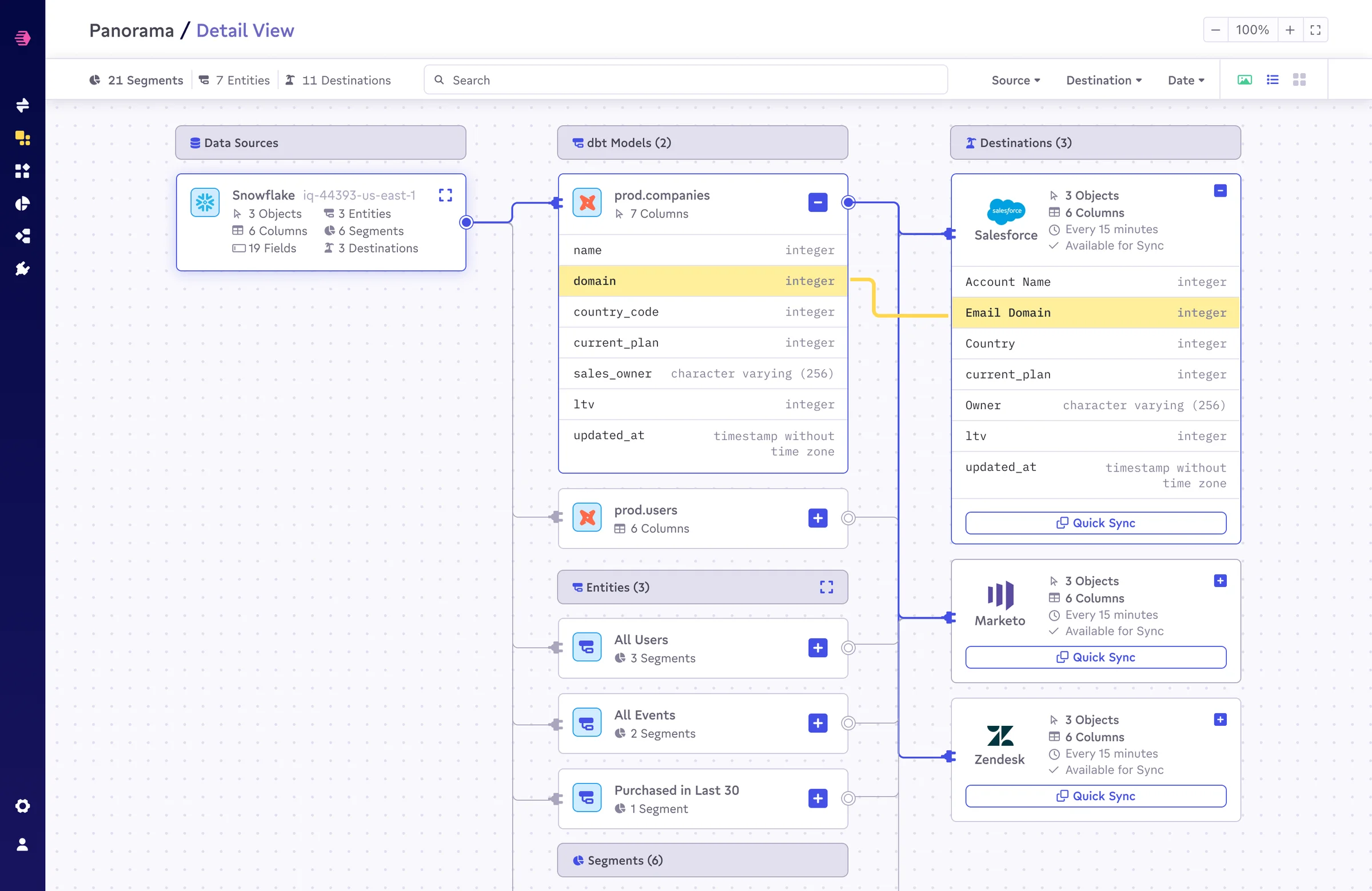
Data teams face a structural contradiction. Their work is fundamentally relational: data flows from sources, through models, into entities and segments, and out to destinations. But almost every tool in their stack shows them one piece at a time. A source here, a sync log there, a segment builder in a third tab. The graph is invisible.
Panorama is the design response to that contradiction. It's a canvas-centered interface built inside Census that makes the entire data pipeline visible at once, letting teams move between altitude and detail without losing their place.
Three altitudes, one canvas
The design is organized around zoom as a semantic gesture, not just a UI affordance.
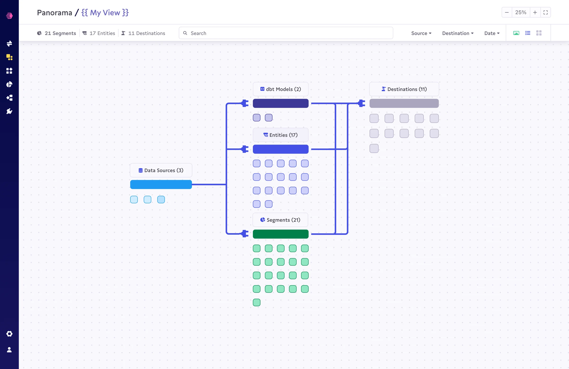
At 0%, the canvas is a strategic overview. Colored bars and node grids give teams a population-level view: how many dbt models, how many Looker models, how many entities, how many segments, how many destinations. The shape of a data architecture, its scale, balance, and anomalies, becomes visible in a glance. Yellow for Looker, blue for dbt, green for segments, gray for destinations.
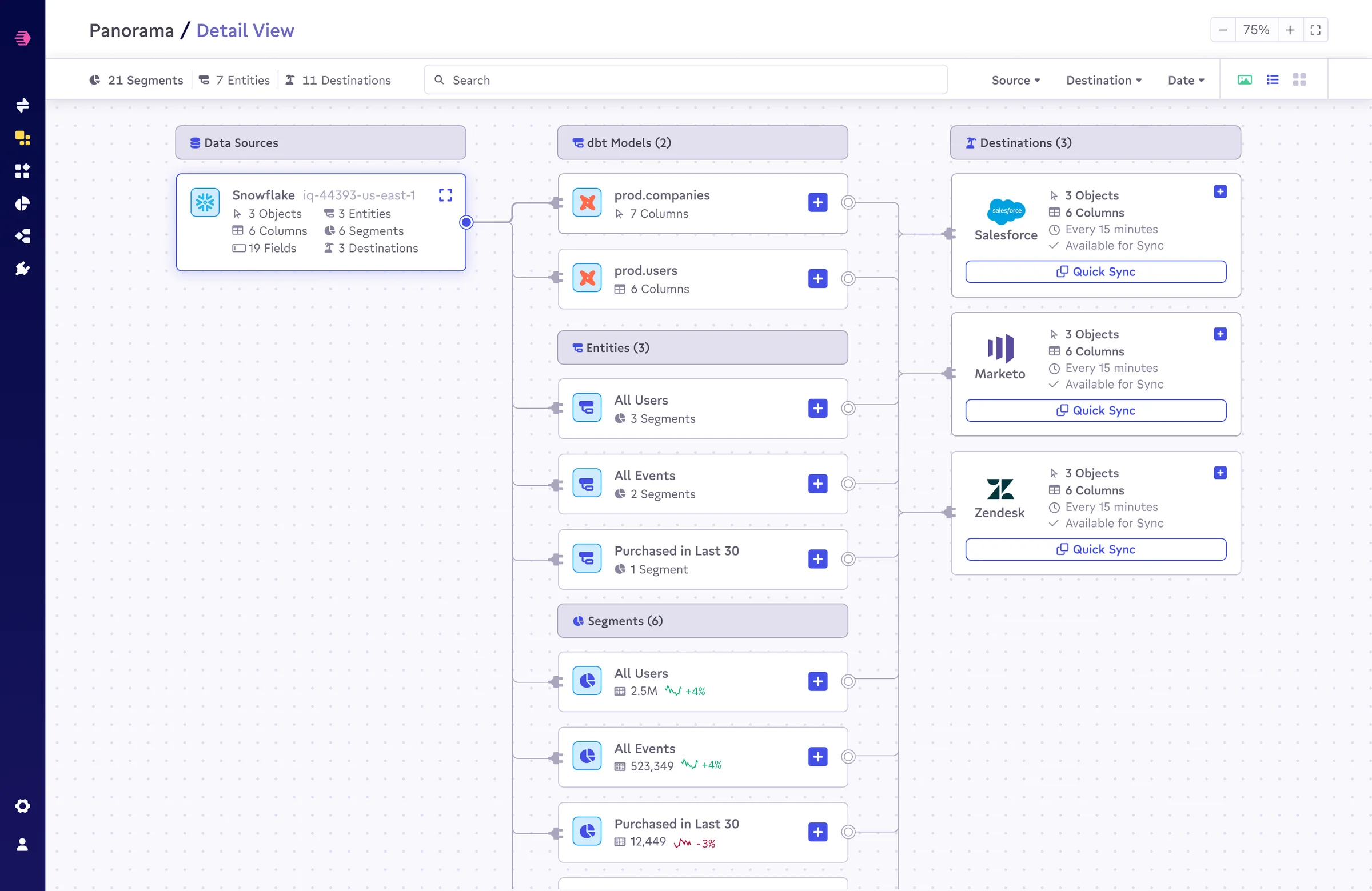
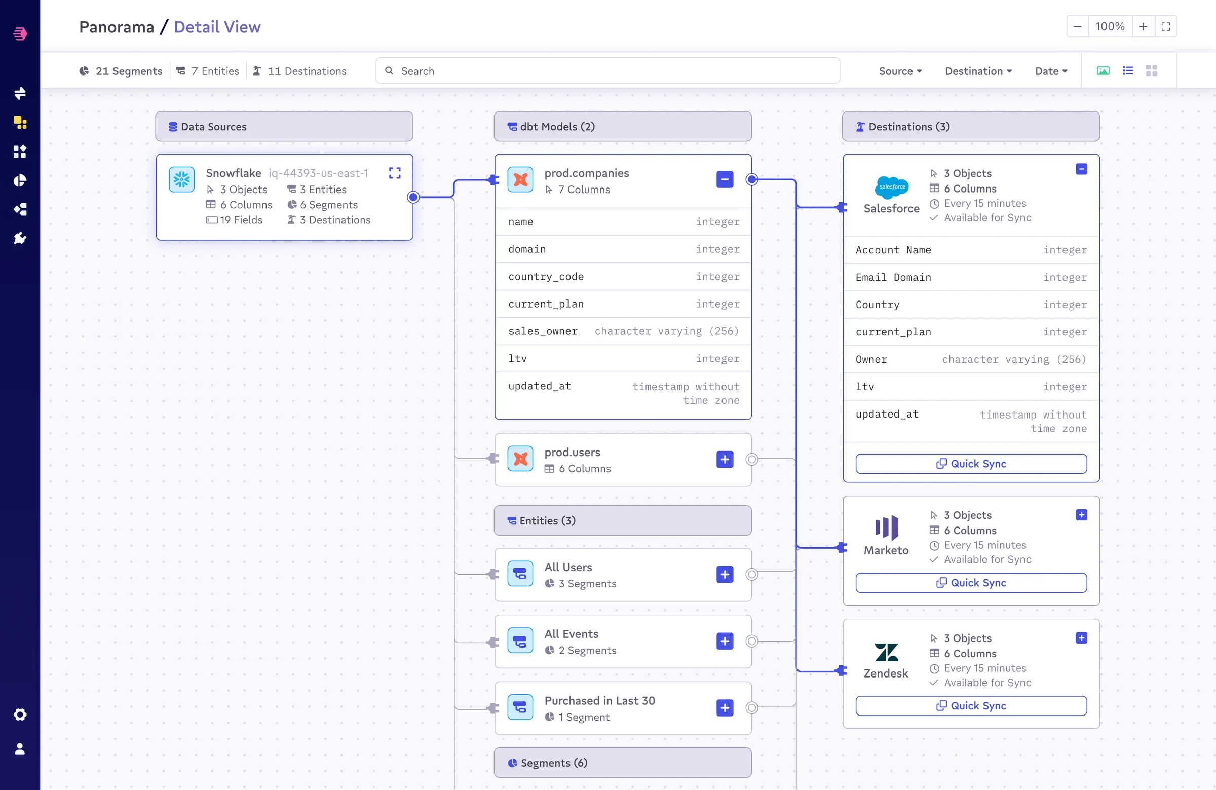
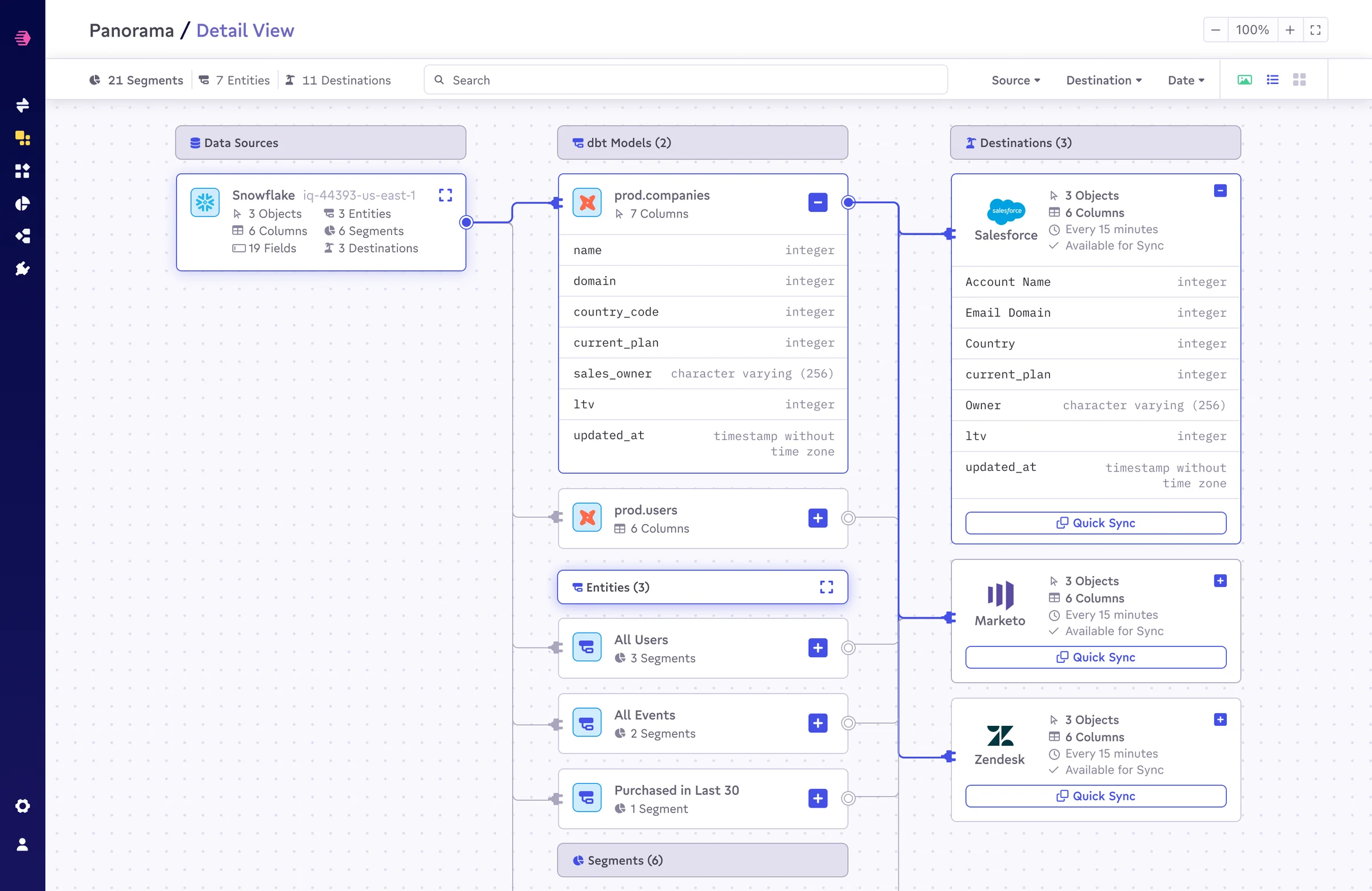
At 75%, individual cards become readable. Data sources show their region, object count, and sync depth. Models show their column counts. Entities show their relationship to segments. Destinations show sync frequency and availability status. The canvas becomes a working document, not just a map.
At 100%, column-level fidelity. Clicking into a dbt model and a destination reveals the exact field mapping between them: which columns flow where, which transformations are in play, where the schema mismatch might be hiding. The domain → Email Domain mapping, the type mismatches, the coverage gaps: all of it readable without navigating to a separate config screen.
Entity relationships as a first-class view
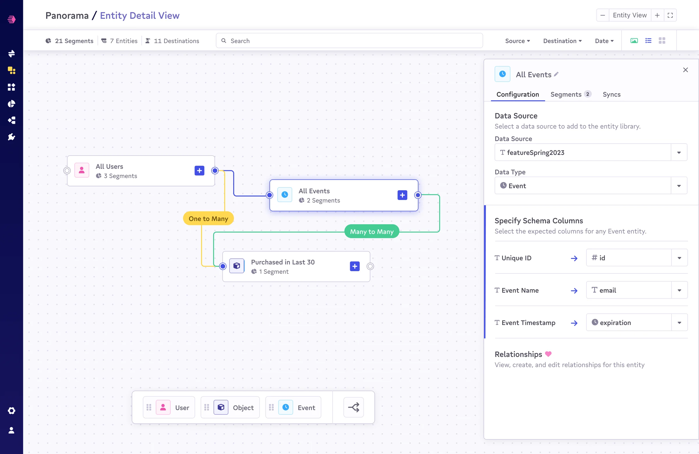
One of the harder design problems was entity relationships. Census's entity model allows teams to define Users, Events, and Objects and connect them with typed relationships (One to Many, Many to Many). This is powerful, but invisible in list-based UIs.
The Entity View separates this concern from the pipeline view entirely. Nodes float on the canvas with color-coded type indicators. Relationship edges carry semantic labels. Clicking any entity opens a configuration panel showing its data source, schema columns, and relationship definitions, without leaving the canvas.
The result is a view that works equally well for explaining the data model to a stakeholder and for debugging why a segment isn't resolving correctly.
The start screen as orientation
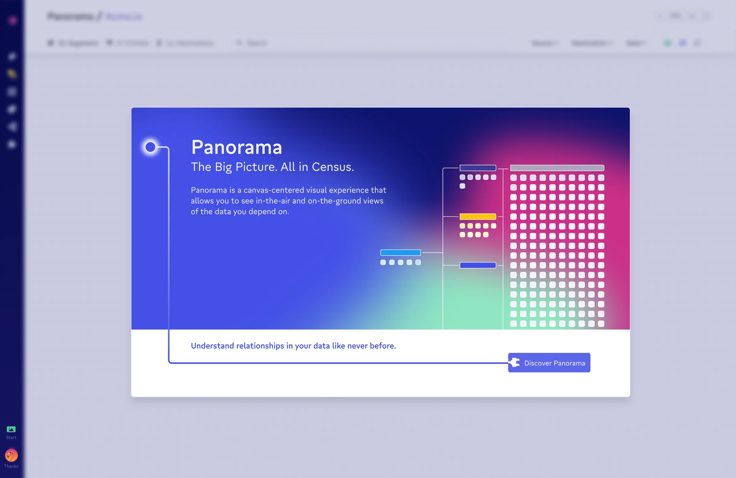
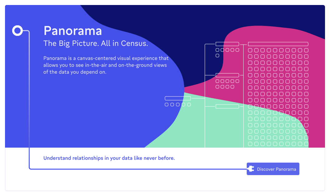
Every new Panorama session begins with a modal: a gradient-rich welcome card that shows a miniature of the canvas alongside the product's core promise. "The Big Picture. All in Census." It's not onboarding in the checkbox sense. It's orientation. A moment to see the shape of what you're entering before you're inside it.
Design notes
The interface deliberately carries a different visual register than the rest of Census's product surface. The dot-grid canvas, the orthogonal connection lines, the thick colored header bars: these borrow the visual grammar of infrastructure tools (Terraform, Retool, n8n) while staying legible to data analysts who live in spreadsheets. It's a canvas for people who don't usually work on canvases.
The color system is load-bearing: cyan for sources (data coming in), blue for models and entities (defined structure), yellow for Looker (a specific integration type), green for segments (derived audiences), gray for destinations (data going out). The palette is consistent across zoom levels so the abstract view and the detail view feel like the same space.
Connector lines use orthogonal routing: right-angle elbows, not bezier curves. Bezier curves feel like diagrams; orthogonal lines feel like wiring. Panorama is closer to wiring.