The last progress report was in July. Since then Ellsworth has picked up four new ways to look at the collection, a way to listen to it, a place to curate your own exhibitions, and a much stricter standard for the text it writes about artists.
Here's the short version:
| Feature | What it shows you | Where |
|---|---|---|
| In Person | Every work at its real size, beside a person | Visualize → In Person |
| Pigment Weather | 700 years of color as a river, with the pigments that changed it | Visualize → Pigment Weather |
| Career Ribbons | An artist's whole career as one woven strip of color | Visualize → Career Ribbons |
| Contemporaries | Who was alive at the same time, and how old they were | Visualize → Contemporaries |
| Hear the palette | Color turned into music, downloadable as WAV or MIDI | Pigment Weather, Career Ribbons |
| Exhibitions | Curate a show from the catalog and get it reviewed by a critic | Play → Exhibitions |
| Grounded profiles | Artist texts written from sources, with a way to report mistakes | Every artist page |
Every new study has a How to read this button next to its title. If something on screen is confusing, start there.
In Person
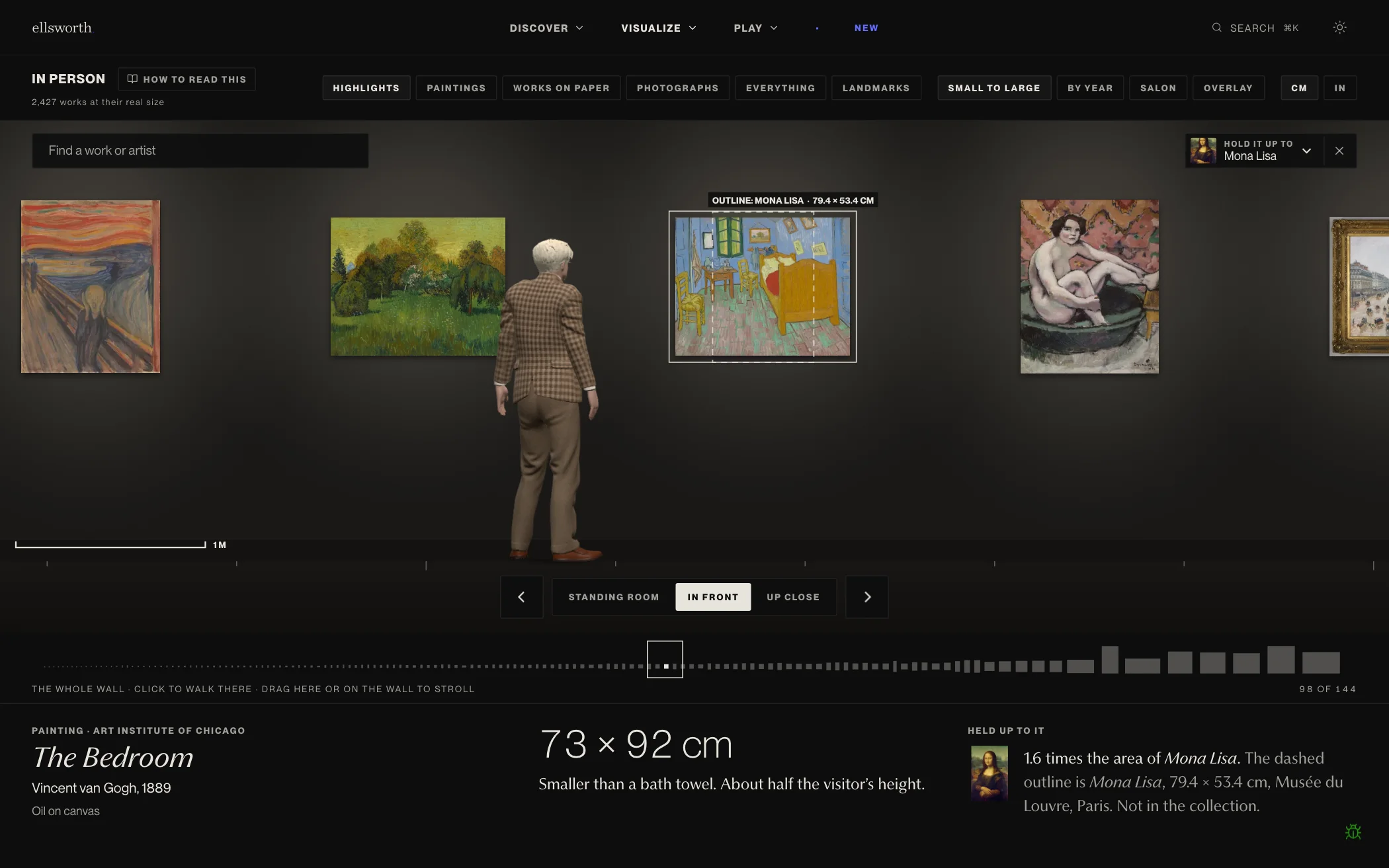
A screen makes every painting the same size. The Bedroom and a postage-stamp miniature both fill your phone. In Person puts the collection back on a wall at its recorded height and width, all at the same scale, with a visitor 170 cm tall standing beside it so you always have a body to measure against.
The dashed rectangle is the Mona Lisa, drawn at its real size (79.4 × 53.4 cm, the size of its wooden panel) and centered on whatever you're looking at. Here it shows that The Bedroom is about 1.6 times its area. You can swap the Mona Lisa for ten other famous paintings, including Las Meninas, The Night Watch, The Garden of Earthly Delights and The Raft of the Medusa. The sizes come from each holding museum's own records.
How to use it
- Walk. Use the ← and → arrow keys, the arrow buttons, or drag the wall. Hold an arrow to run.
- Change distance. Standing room steps back to take in the wall, In front stands you at the work, Up close fills the screen with it. Keys 1, 2 and 3 do the same.
- Pick a room. Highlights hangs two works each by the best-known artists plus the smallest and largest. Paintings, Works on paper and Photographs narrow it down. Everything hangs all of it. Landmarks hangs the famous outlines themselves.
- Change the hang. Small to large and By year line works up at eye level. Overlay stacks every work in one corner so you can see the whole range of sizes at once.
- Find something. Search for a work or artist in the top left to jump straight to it.
- Read the size. Below the wall, every work gets its dimensions in cm or inches and an everyday comparison, like "Smaller than a bath towel. About half the visitor's height."
The Salon hang
Choose Salon and the wall changes. Works stack floor to ceiling the way 19th-century exhibitions hung them, small works near eye level and big ones "skied" up high, on an oxblood wall with a stone dado modeled on the Koch Gallery at the MFA Boston. Each group of works gets its own soft spotlight from a ceiling track.
The huge pale canvas on the left is Kenneth Noland's White Median, 218 × 561 cm. The visitor barely reaches its lower edge.
A few details worth knowing:
- The visitor moves. They walk, run, look at the work you stop in front of, and if you press ↑, ↓ or the space bar while running, jump, slide, or run up the wall.
- Only trustworthy sizes hang. A work goes on the wall only when its photograph's proportions match its recorded dimensions within 10%. That screens out records that measure the mat or frame instead of the image, records with height and width swapped, and the wrong photograph. Copies credited to the original artist ("after Leonardo") are left out too.
- Your screen isn't calibrated, so nothing is literally life size. Everything is at the same scale as the visitor, and the scale bar on the floor shows how long a metre is right now.
Pigment Weather
Seven centuries of paintings, from 1300 to 2019, drawn as a river. The height of each band is how much of that period's paintings is that color family, out of 14 families from whites and ochres through reds, blues and greens to blacks.
Each band is painted in the real average color of its family for that period, so the blues of 1500 and the blues of 1960 are different blues. The pins along the top mark when key pigments reached artists, from Prussian blue (about 1706) through cobalt, emerald green, synthetic ultramarine, viridian, cadmium red and titanium white to acrylic paint (1947 to 1955).
How to use it
- Select a period by clicking the river or dragging the slider. The side panel shows that period's percentages and the works where your chosen color runs deepest.
- Select a pin to read the story of that pigment and check whether the river responds.
- Choose a color family to isolate it, with a line chart of that color across all 700 years. Press Esc or Show all colors to bring everything back.
- Vivid only hides whites, browns, greys and blacks so changes in the stronger colors stand out.
- Paintings / All 2D works switches between paintings only and every flat work (drawings, prints, textiles and photographs too).
The pin for 1841 is the paint tube itself. John Goffe Rand patented the collapsible tin tube that year, and oil paint could leave the studio. Select the decades that follow and watch what the river does.
Career Ribbons
Every dated painting an artist made, in order, reduced to its colors and woven into a single ribbon across their career. Each work is a thin vertical slice showing its six strongest colors, lightest at the top and darkest at the bottom, with the more dominant colors getting thicker bands. The fine line behind each ribbon is the artist's life, birth to death.
How to use it
- Calendar lines everyone up by year, so artists of one era sit together.
- By age starts everyone at birth, so you can compare what people made at 30 and at 70.
- Textile gives every work the same width and ignores time, leaving only the sequence of colors.
- Sort by birth year, biggest change, lightest first, most colorful, longest career, movement or name.
- Click any ribbon to open it: every work in order with its image, the ribbon at full size, and a button to hear it.
- Look closer opens guided stories along the top: Picasso turns blue, Mondrian leaves the earth, Alma Thomas begins late, Turner dissolves into light, Goya darkens, Grandma Moses at 79 and more.
Open Picasso turns blue and the ribbon drops into cold, dark blue around 1903, at The Old Guitarist. The Blue Period shows up as a color change in the data before you've read a word about it.
Contemporaries
Every artist's life as a thread, stacked in order of birth. Pick a year and Ellsworth tells you who was alive, how old each of them was, and who was born and who died that year.
In 1863, Ingres is 83 and Monet is 23. Van Gogh is 10, Edvard Munch is born, and Delacroix dies.
How to use it
- Drag across the threads or use the year slider. The −1 and +1 buttons step a year at a time.
- Play time runs the years forward on their own.
- In the room at the bottom shows every living artist that year as a dot, placed by age, from childhood to old age.
- Color threads by region (from recorded nationality) or by gender.
- Jump to an era with the buttons at the top.
- Could they have met? Pick any two artists and see whether their lives overlapped, and for how long.
Overlapping lives mean two people could have met. Whether they did is a question for the biographies.
Hear the palette
Pigment Weather and Career Ribbons both play as music. Press Hear 700 years or Hear the palette and each period (or each painting) plays as a chord built from its strongest colors.
The mapping follows research on how people match colors to music (Palmer et al., PNAS 2013):
- Lightness sets pitch. Lighter colors sound higher.
- Saturation sets tone and loudness. Vivid colors are brighter and louder.
- Mood sets mode and tempo. Light, warm, vivid palettes play in major modes and move faster. Dark, cool, muted ones play in minor modes, more slowly.
- Hue only pans a sound left or right, because there's no agreed sound for "blue."
In Pigment Weather you can also choose one color family and hear it alone, as a melody over a quieter chord. It gets louder when that color fills more of the period, and goes silent when it's all but absent.
Every soundtrack downloads as WAV audio or MIDI, using the same buttons beside Play. The MIDI file carries a marker for each chord, so you can drop 700 years of painting into a DAW and score something with it.
Exhibitions and the critics
Ellsworth can now help you curate an exhibition from its catalog, and then send it to a critic for review.
How to use it
- Draft. Go to Exhibitions → Create an exhibition. Roll the dice lets Ellsworth pick the theme, era and artists while you react and pin the works you like. Build it myself walks you through theme, era, artists and color, or lets you write a free-form statement in your own words.
- Curate. Ellsworth proposes a roster of works from the catalog. Pin the works you want to keep.
- Review. A critic who fits the show writes a review and gives it a score.
- Publish and open. Your exhibition gets its own page with a title, statement, the works, and the review. Anyone can Remix it into a show of their own or Share it.
There are seven critics, each with a specialty and a temperament: a formalist, a political historian, a skeptic of safe survey shows, an old-guard connoisseur, a critic who writes from feeling first, a specialist in sculpture and textiles, and one focused on the politics of now. The critics page tracks how many reviews each has written and their average score, so you can see who's hardest to please.
The curator is held to the same accuracy bar as the rest of the site. Thousands of artworks were individually tagged for what they actually depict, so a show about water pulls in paintings of water, and works that don't fit the show get dropped from the roster with a notice telling you why.
Profiles you can check
The artist and movement profiles were rebuilt from the ground up. Each one is now written from the artist's Wikipedia article and the museum records of their works in the catalog, by Claude Opus 5.5, and then stored so every visitor reads the same text. Where little is recorded, the profile is short and says so.
Every profile ends with a line naming what it was written from and a Report an inaccuracy link. In a claim-by-claim fact-check of a sample, the share of claims contradicted by sources fell from 16% to under 2%.
Alongside that, artist records across the catalog were corrected: nearly 90 recorded genders that disagreed with Wikidata, a set of birth and death dates, a handful of artists linked to the wrong person entirely, and about 250 artwork dates that turned out to be the artist's birth year carried over from a museum record.
Methods & data
The new Methods & data page (linked from every How to read this panel) explains where the works come from and the rules every view follows:
- Removals stay removed. Works taken down by request or found to be misattributed never come back, even when a museum's data is imported again.
- Impossible dates are dropped. A painting dated after its artist died, or before they turned 8, stays off the timelines.
- Vague dates stay out of timelines. If a museum can only date a work to a span of more than 25 years, it isn't placed.
- Duplicates are merged. One artist stored twice becomes one, and a work imported from both a museum and Wikidata appears once.
- Color views use only flat works. Photographs of sculpture and objects include walls, pedestals, sky and tabletops, so their colors aren't the work's own.
If you spot a mistake anywhere, the bug icon in the lower right of every page lets you highlight the exact thing that's wrong.
One caveat
The colors in Pigment Weather and Career Ribbons come from photographs of paintings, not from the paint. Yellowed varnish, aging pigments, lighting and the camera all play a part, so an old painting can read warmer or darker than it looked when it was new. Albert Pinkham Ryder's ribbon, which sinks into near-black, is partly a record of how his paintings have deteriorated.
The collection also reflects what museums have collected and put online, which leans heavily toward Europe and the United States. These studies describe that collection, and the How to read this panels flag it wherever it matters.
Explore Ellsworth · Read the earlier progress report · Why I built it